About the Project
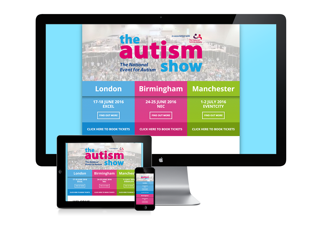
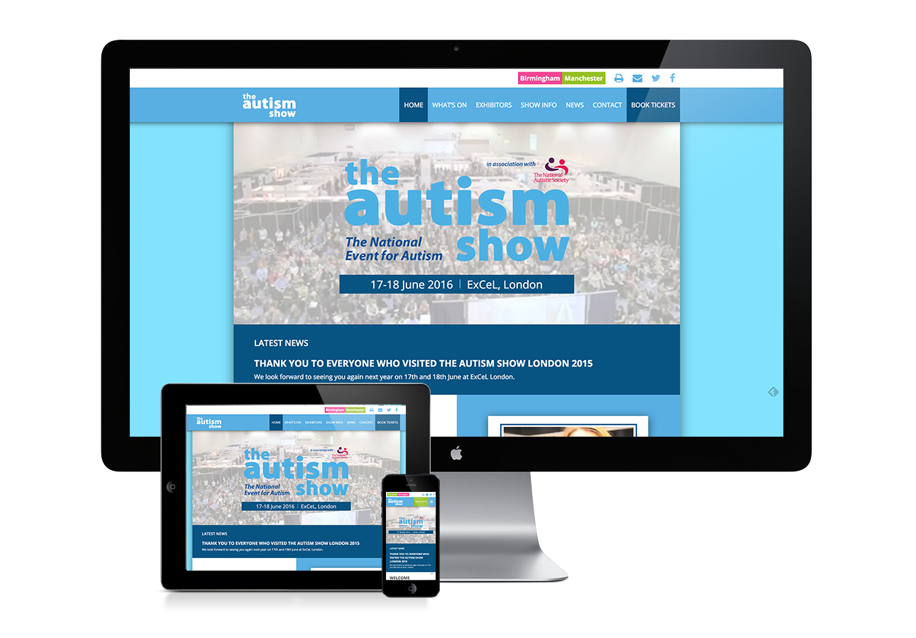
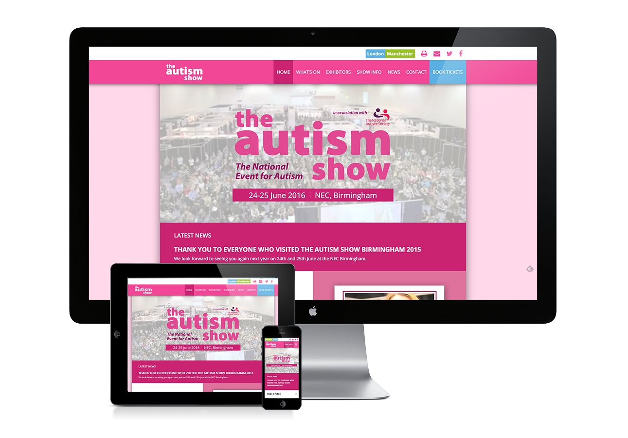
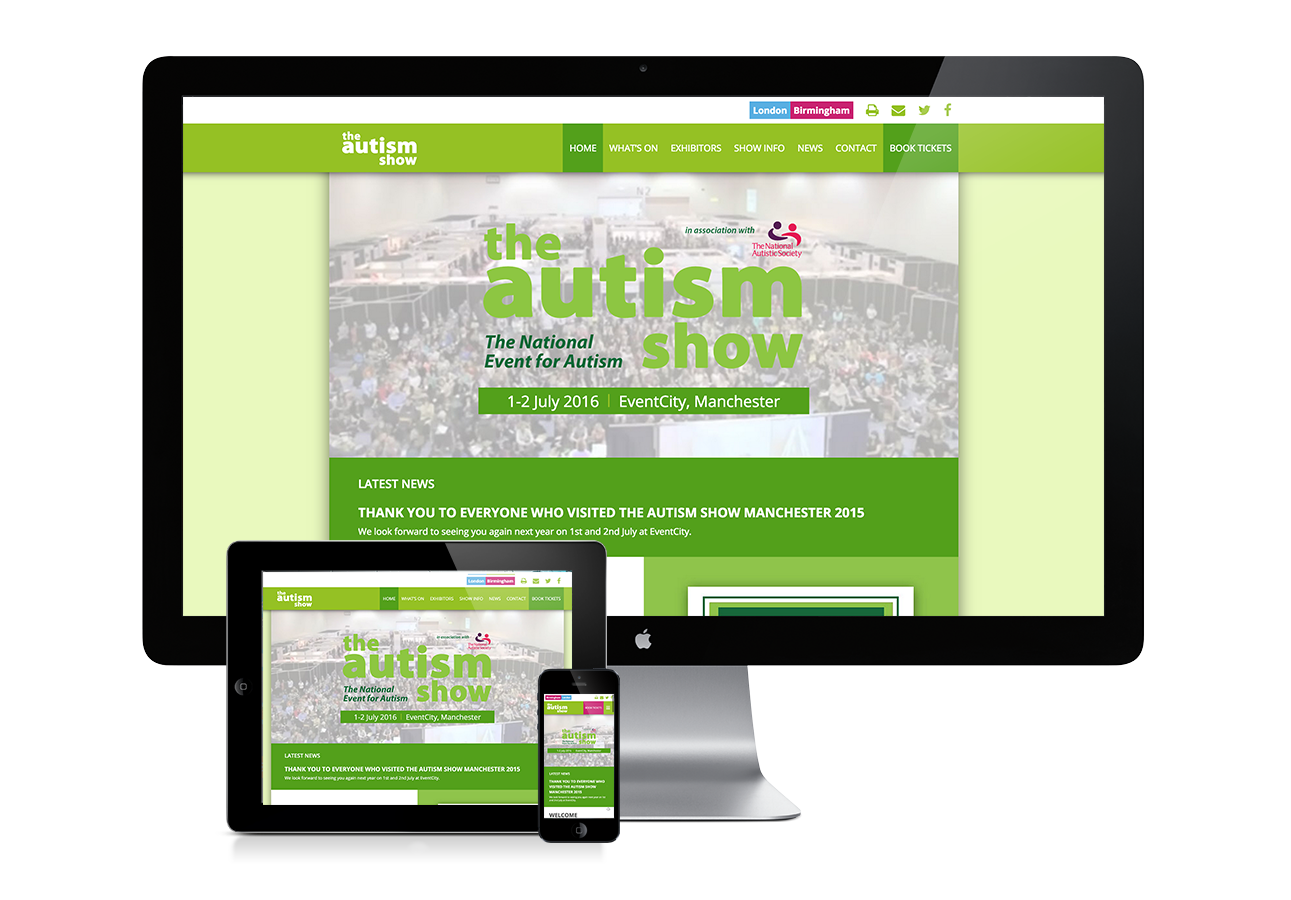
The Autism Show’s original website was a nightmare to use and navigate when I first laid eyes on it. While the site would’ve been ok to use when the show initially started, it had since expanded into three separate venues, which served for an awful user experience. Given the unique chance of a structural overhaul,I had to make things right. On the newly designed site the user is greeted with an initial splash page, which is linked to the three separate internal sites. Each site is also colour coded to match each show’s unique design, making for greatly improved user experience. No longer will the user need to decipher pages and pages of content just to figure out one venue’s details.
Copyright © 2015 APronger Designs. Copying content from this site is strictly prohibited.


